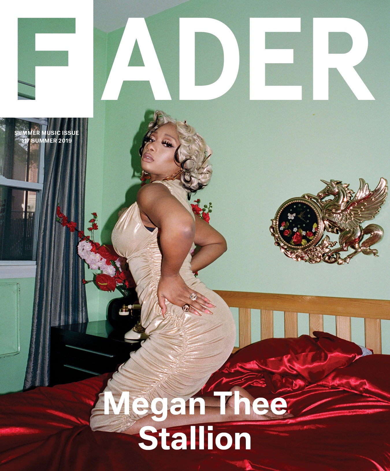
 For "COMPLEX" magazine, their masthead is a simple bold black. This does not really catch the eye as a masthead but leaves room for other components of the magazine cover to stand out.
 For the "XXL" magazine, their masthead has a big red box around white letters that say "XXL". this is very bright and intriguing to the eye. A masthead like this would attract more people than if it were to be a plain masthead.
 These are some of my masthead ideas and how I may put them on my magazine cover as far as color and font goes. For "XXS" I chose a blue color with a classic font the light may be appealing to a wide group of people as well as the other mastheads. For "OTR" (On The Rise) I chose a purple color with a trendy font. For "RedLight" I chose to feature the word "Red" with a red color and the word "Light" with a light blue color to contrast with the red with different fonts for both. For "Clash" I chose a green color with another classic font; green is a very trendy color at the moment.
Research:


No comments:
Post a Comment