For "COMPLEX" magazine, their masthead is a simple bold black. This does not really catch the eye as a masthead but leaves room for other components of the magazine cover to stand out.
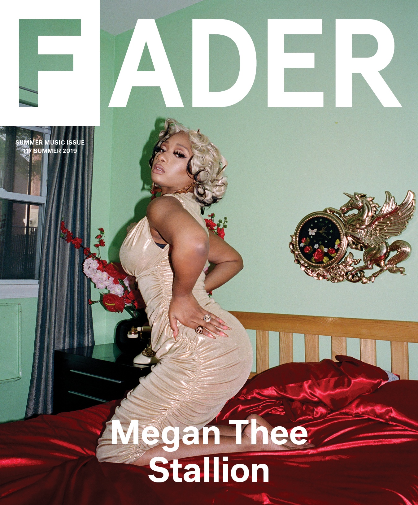
 In "FADER" magazine, their masthead is simple black with thinner lines than the "COMPLEX" masthead but includes a black box over the F making it the only white letter in the masthead.
 For the "XXL" magazine, their masthead has a big red box around white letters that say "XXL". this is very bright and intriguing to the eye. A masthead like this would attract more people than if it were to be a plain masthead.
 These are some of my masthead ideas and how I may put them on my magazine cover as far as color and font goes. For "XXS" I chose a blue color with a classic font the light may be appealing to a wide group of people as well as the other mastheads. For "OTR" (On The Rise) I chose a purple color with a trendy font. For "RedLight" I chose to feature the word "Red" with a red color and the word "Light" with a light blue color to contrast with the red with different fonts for both. For "Clash" I chose a green color with another classic font; green is a very trendy color at the moment.
Research: